Charts#

Visual summary of the current pass across 5 lecture series and 7 in-scope rule categories.

Every figure on this page is generated at build time from the CSVs in lectures/data/, which are themselves produced by tools/qestyle_scan.py and tools/qestyle_score.py from a pinned corpus snapshot. Nothing here is typed in by hand, so the charts cannot drift away from the scoreboard or the per-lecture reports.

Hide code cell source

import csv
import os

import matplotlib.pyplot as plt
import numpy as np

# The book may be built from the repo root or from lectures/ — look in both.
DATA = next(d for d in ('data', 'lectures/data', '../lectures/data')
            if os.path.isdir(d))


def load(name):
    with open(os.path.join(DATA, name), newline='', encoding='utf-8') as fh:
        return list(csv.DictReader(fh))


def num(v):
    try:
        return float(v)
    except (TypeError, ValueError):
        return np.nan


summary = load('series_summary.csv')
reach = load('rule_reach.csv')
titles = {r['rule']: r['title'] for r in load('rule_titles.csv')}
history = load('rule_reach_history.csv')

CATS = ['writing', 'math', 'code', 'figures', 'references', 'links', 'admonitions']
LABEL = {'writing': 'Writing', 'math': 'Math', 'code': 'Code', 'figures': 'Figures',
         'references': 'References', 'links': 'Links', 'admonitions': 'Admonitions'}
SHORT = {'lecture-python-intro': 'intro',
         'lecture-python-programming': 'programming',
         'lecture-python.myst': 'python.myst',
         'lecture-python-advanced.myst': 'advanced',
         'lecture-dp': 'dp'}

body = [r for r in summary if r['series'] != 'TOTAL']
body.sort(key=lambda r: num(r['overall']))
total = next(r for r in summary if r['series'] == 'TOTAL')

series = [SHORT.get(r['series'], r['series']) for r in body]
scores = np.array([[num(r[c]) for c in CATS] for r in body])
weights = np.array([float(r['lectures']) for r in body])
n_corpus = int(total['lectures'])

print(f'{n_corpus} lectures · corpus average {total["overall"]} / 10')
348 lectures · corpus average 7.7 / 10

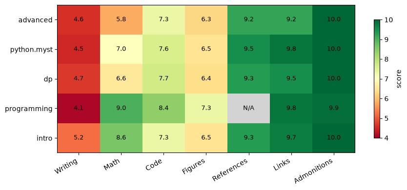
Score heatmap — series × category#

Each cell is the mean score for that category across the series’ lectures. Grey means the category applies to too few lectures in the series to average.
Hide code cell source

fig, ax = plt.subplots(figsize=(9, 4))
masked = np.ma.masked_invalid(scores)
cmap = plt.get_cmap('RdYlGn').copy()
cmap.set_bad(color='lightgray')
im = ax.imshow(masked, cmap=cmap, vmin=4, vmax=10, aspect='auto')

ax.set_xticks(range(len(CATS)))
ax.set_xticklabels([LABEL[c] for c in CATS], rotation=30, ha='right')
ax.set_yticks(range(len(series)))
ax.set_yticklabels(series)

for i in range(len(series)):
    for j in range(len(CATS)):
        val = scores[i, j]
        ax.text(j, i, 'N/A' if np.isnan(val) else f'{val:.1f}',
                ha='center', va='center', fontsize=9)

fig.colorbar(im, ax=ax, shrink=0.8, label='score')
plt.tight_layout()
plt.show()
_images/f40b9bc7b42253ba7213f1f3f30bf9c24a674224264a0e491a063c9568903ce6.png

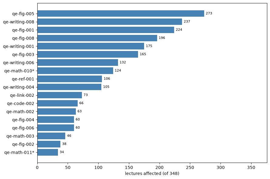
Most frequently violated rules#

Reach across the corpus, in lectures. Rules marked * are the proposed additions to the rule registry — documented in the style guide but not yet coded.
Hide code cell source

top = sorted(reach, key=lambda r: -int(r['lectures_affected']))[:18]
names = [r['rule'] + ('*' if r['proposed'] == '1' else '') for r in top]
vals = [int(r['lectures_affected']) for r in top]
order = np.argsort(vals)

fig, ax = plt.subplots(figsize=(9, 6))
ax.barh([names[i] for i in order], [vals[i] for i in order], color='steelblue')
ax.set_xlabel(f'lectures affected (of {n_corpus})')
for i, idx in enumerate(order):
    ax.text(vals[idx] + n_corpus * 0.008, i, str(vals[idx]), va='center', fontsize=8)
ax.set_xlim(0, n_corpus * 1.08)
plt.tight_layout()
plt.show()
_images/ef7c0bd00f58b066adce691d829b62b86881bfc1fc721be4ec3972f371346d03.png

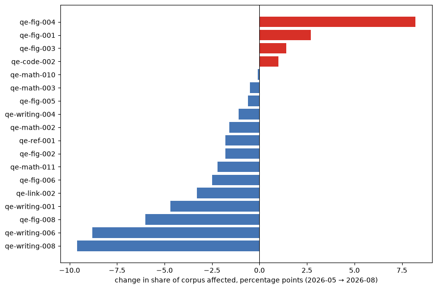
Change since the previous pass#

The same checks run over both corpus snapshots, so these shares are directly comparable — the measurement did not change between passes, only the lectures did. Bars to the right mean the rule now reaches a larger share of the corpus.
Hide code cell source

periods = sorted({r['period'] for r in history})
if len(periods) >= 2:
    prev, curr = periods[-2], periods[-1]
    a = {r['rule']: float(r['share_pct']) for r in history if r['period'] == prev}
    b = {r['rule']: float(r['share_pct']) for r in history if r['period'] == curr}
    rules = sorted(set(a) | set(b), key=lambda r: -max(a.get(r, 0), b.get(r, 0)))[:18]
    delta = [b.get(r, 0) - a.get(r, 0) for r in rules]
    order = np.argsort(delta)

    fig, ax = plt.subplots(figsize=(9, 6))
    colors = ['#d73027' if delta[i] > 0 else '#4575b4' for i in order]
    ax.barh([rules[i] for i in order], [delta[i] for i in order], color=colors)
    ax.axvline(0, color='black', lw=0.8)
    ax.set_xlabel(f'change in share of corpus affected, percentage points '
                  f'({prev}{curr})')
    plt.tight_layout()
    plt.show()
else:
    print('Only one pass on record — the trend chart appears from the second pass on.')
_images/499289502bdb7765d871063faa5fb761766a3bda8d6d4e5cd70ce81b0c1ec4cd.png

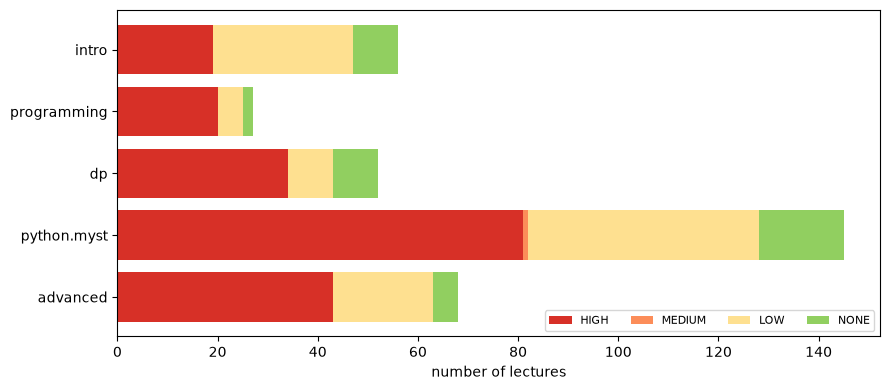
Priority distribution by series#

Hide code cell source

labels = ['HIGH', 'MEDIUM', 'LOW', 'NONE']
colors = ['#d73027', '#fc8d59', '#fee090', '#91cf60']
data = np.array([[int(r[p]) for p in labels] for r in body], dtype=float)

fig, ax = plt.subplots(figsize=(9, 4))
left = np.zeros(len(series))
for k, lab in enumerate(labels):
    ax.barh(series, data[:, k], left=left, color=colors[k], label=lab)
    left += data[:, k]
ax.set_xlabel('number of lectures')
ax.legend(ncol=4, loc='lower right', fontsize=8)
plt.tight_layout()
plt.show()
_images/ecae3876d0b5f3d75cd4f238e0165b24f1aa4e1856bfbca936f66dafa6a654cd.png

Corpus-weighted category averages#

Where the corpus is strongest and weakest overall, weighted by how many lectures each series contributes.

Hide code cell source

cat_avgs = []
for j in range(len(CATS)):
    col = scores[:, j]
    m = ~np.isnan(col)
    cat_avgs.append(np.average(col[m], weights=weights[m]) if m.any() else np.nan)

fig, ax = plt.subplots(figsize=(9, 4))
bars = ax.bar([LABEL[c] for c in CATS], cat_avgs, color='slateblue')
ax.set_ylim(0, 10)
ax.set_ylabel('weighted average score')
ax.axhline(8.6, color='green', ls='--', lw=1, label='NONE threshold (8.6)')
ax.axhline(5.0, color='red', ls='--', lw=1, label='HIGH threshold (5.0)')
for b, v in zip(bars, cat_avgs):
    ax.text(b.get_x() + b.get_width() / 2, v + 0.1, f'{v:.1f}',
            ha='center', fontsize=8)
ax.legend(fontsize=8)
plt.xticks(rotation=30, ha='right')
plt.tight_layout()
plt.show()
_images/62835046280a744aedc317c4646520b46c74a95b4dcf05f9409f6ccbfd40eb2c.png