4. Matplotlib#
4.1. Overview#
ഈ lectures-ൽ Matplotlib ഉപയോഗിച്ച് നമ്മൾ already ധാരാളം figures generate ചെയ്തിട്ടുണ്ട്.
Matplotlib എന്നത്, scientific computing-നായി design ചെയ്തിരിക്കുന്ന ഒരു മികച്ച graphics library ആണ്. ഇതിൽ ഉള്ളത്:
high-quality 2D and 3D plots
സാധാരണ ഉപയോഗിക്കുന്ന എല്ലാ formats-ലും output ലഭിക്കുന്നു — PDF, PNG, etc.
LaTeX integration
presentation-ന്റെ ഓരോ ചെറിയ കാര്യവും വരെ control ചെയ്യാൻ കഴിയുന്നു
animation, etc.
4.1.1. Matplotlib's Split Personality#
Plotting-നായി രണ്ട് വ്യത്യസ്ത interfaces നൽകുന്നു എന്നതാണ് Matplotlib-ന്റെ ഒരു പ്രത്യേകത.
അതിൽ ഒന്ന്, simple ആയ MATLAB-style API (Application Programming Interface) ആണ്. MATLAB ഉപയോഗിച്ചിരുന്നവർക്ക് എളുപ്പത്തിൽ ഉപയോഗിക്കാനാകുന്ന തരത്തിലാണ് ഇത് എഴുതിയിരിക്കുന്നത്.
മറ്റൊന്ന്, കൂടുതൽ "Pythonic" ആയ object-oriented API ആണ്.
താഴെ പറയുന്ന കാരണങ്ങളാൽ, രണ്ടാമത്തെ API ഉപയോഗിക്കാനാണ് ഞങ്ങൾ recommend ചെയ്യുന്നത്.
പക്ഷേ ആദ്യം, ഇവ തമ്മിലുള്ള വ്യത്യാസം നമുക്ക് നോക്കാം.
4.2. The APIs#
4.2.1. The MATLAB-style API#
Introductory പാഠങ്ങളിൽ കാണാൻ സാധ്യതയുള്ള ഒരു എളുപ്പമായ example താഴെ കാണാം:
import matplotlib.pyplot as plt
import numpy as np

x = np.linspace(0, 10, 200)
y = np.sin(x)

plt.plot(x, y, 'b-', linewidth=2)
plt.show()
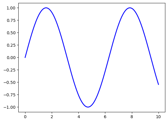
ഇത് simple-ഉം convenient-ഉം ആണ്. പക്ഷേ കുറച്ചൊക്കെ പരിമിതികളും, Python-ന്റെ സാധാരണ ശൈലിയോട് പൊരുത്തപ്പെടാത്ത സ്വഭാവവും ഇതിനുണ്ട്.
For example, ഇവിടുത്തെ function call-കളിൽ, programmer-നെ അറിയിക്കാതെ തന്നെ നിരവധി object-ുകൾ create ചെയ്യപ്പെടുകയും, അവ pass ചെയ്യപ്പെടുകയും ചെയ്യുന്നു.
കാര്യങ്ങൾ കൂടുതൽ വ്യക്തമായി പ്രകടിപ്പിക്കുന്ന ഒരു programming style ആണ് Python programmers പൊതുവെ prefer ചെയ്യുന്നത്. (ഒരു code block-ൽ, import this എന്ന് type ചെയ്ത്, run ചെയ്യുക. തുടർന്ന് ലഭിക്കുന്ന output-ന്റെ രണ്ടാമത്തെ line നോക്കുക.)
ഇത് നമ്മളെ alternative ആയ, object-oriented Matplotlib API-യിലേക്ക് എത്തിക്കുന്നു.
4.2.2. The Object-Oriented API#
Object-oriented API ഉപയോഗിച്ച് മുൻപത്തെ figure create ചെയ്യുന്ന code താഴെ കാണാം:
fig, ax = plt.subplots()
ax.plot(x, y, 'b-', linewidth=2)
plt.show()
ഇവിടെ fig, ax = plt.subplots() എന്ന call, ഒരു pair return ചെയ്യുന്നു. അതിൽ:
figഒരുFigureinstance ആണ്---ഒരു blank canvas പോലെ കരുതാം.axഒരുAxesSubplotinstance ആണ്---plotting ചെയ്യാനുള്ള ഒരു frame ആയി കരുതാം.
plot() function യഥാർത്ഥത്തിൽ ax-ന്റെ ഒരു method ആണ്.
കുറച്ചുകൂടി typing ആവശ്യമുണ്ടെങ്കിലും, objects കൂടുതൽ വ്യക്തമായി ഉപയോഗിക്കുന്നത് നമുക്ക് മികച്ച control നൽകുന്നു.
നമ്മൾ മുന്നോട്ട് പോകുമ്പോൾ ഇത് കൂടുതൽ വ്യക്തമാകും.
4.2.3. Tweaks#
ഇവിടെ line-ന്റെ നിറം red ആക്കി മാറ്റുകയും, അതോടൊപ്പം ഒരു legend ചേർക്കുകയും ചെയ്തിരിക്കുന്നു:
fig, ax = plt.subplots()
ax.plot(x, y, 'r-', linewidth=2, label='sine function', alpha=0.6)
ax.legend()
plt.show()
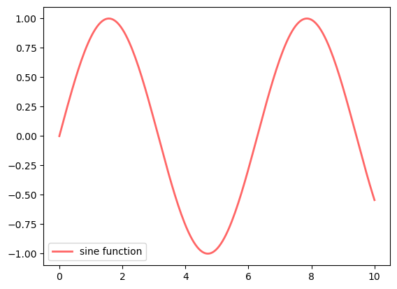
Line-നെ അല്പം transparent ആക്കാൻ alpha ഉപയോഗിച്ചിട്ടുണ്ട്---ഇത് line-ന് കൂടുതൽ smooth ആയ രൂപം നൽകുന്നു.
ax.legend()-ന് പകരം ax.legend(loc='upper center') ഉപയോഗിച്ചാൽ legend-ന്റെ സ്ഥാനം മാറ്റാം.
fig, ax = plt.subplots()
ax.plot(x, y, 'r-', linewidth=2, label='sine function', alpha=0.6)
ax.legend(loc='upper center')
plt.show()
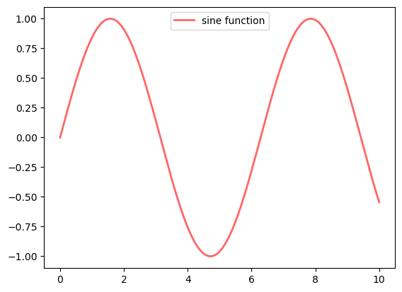
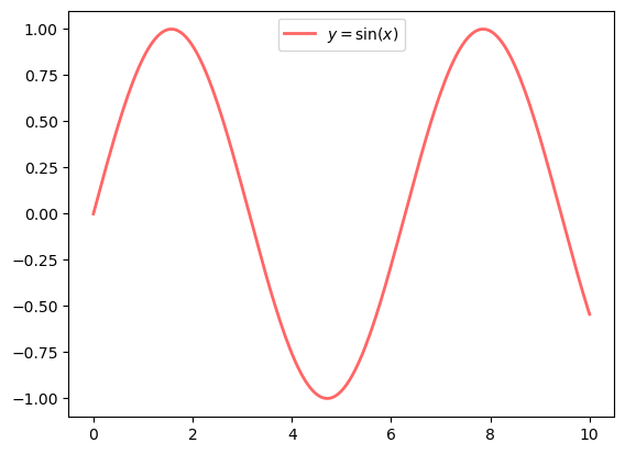
എല്ലാം ശരിയായി configure ചെയ്തിട്ടുണ്ടെങ്കിൽ, LaTeX ചേർക്കുന്നത് വളരെ എളുപ്പമാണ്:
fig, ax = plt.subplots()
ax.plot(x, y, 'r-', linewidth=2, label=r'$y=\sin(x)$', alpha=0.6)
ax.legend(loc='upper center')
plt.show()
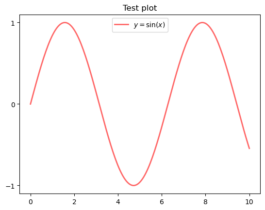
Ticks control ചെയ്യുന്നതും, titles ചേർക്കുന്നതും മറ്റും അതുപോലെതന്നെ എളുപ്പം ആണ്:
fig, ax = plt.subplots()
ax.plot(x, y, 'r-', linewidth=2, label=r'$y=\sin(x)$', alpha=0.6)
ax.legend(loc='upper center')
ax.set_yticks([-1, 0, 1])
ax.set_title('Test plot')
plt.show()
4.3. More Features#
Matplotlib-ൽ ധാരാളം functions-ഉം, features-ഉം ഉണ്ട്. ആവശ്യം വരുന്ന മുറയ്ക്ക്, കാലക്രമേണ അവയെക്കുറിച്ച് മനസ്സിലാക്കാം.
അതിൽ ചിലത് മാത്രം ഇവിടെ പരാമർശിക്കുന്നു.
4.3.1. Multiple Plots on One Axis#
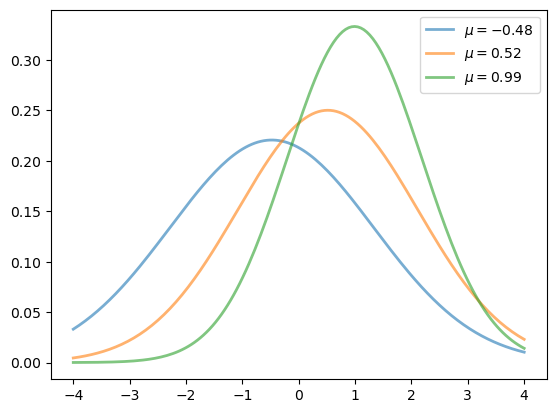
ഒരേ axes-ൽ, ഒന്നിലധികം plots generate ചെയ്യുന്നത് വളരെ എളുപ്പമാണ്.
Randomly മൂന്ന് normal densities generate ചെയ്ത്, അവയുടെ mean-നെ label ചെയ്യുന്ന ഒരു example താഴെ കാണാം:
from scipy.stats import norm
from random import uniform

fig, ax = plt.subplots()
x = np.linspace(-4, 4, 150)
for i in range(3):
    m, s = uniform(-1, 1), uniform(1, 2)
    y = norm.pdf(x, loc=m, scale=s)
    current_label = rf'$\mu = {m:.2}$'
    ax.plot(x, y, linewidth=2, alpha=0.6, label=current_label)
ax.legend()
plt.show()
4.3.2. Multiple Subplots#
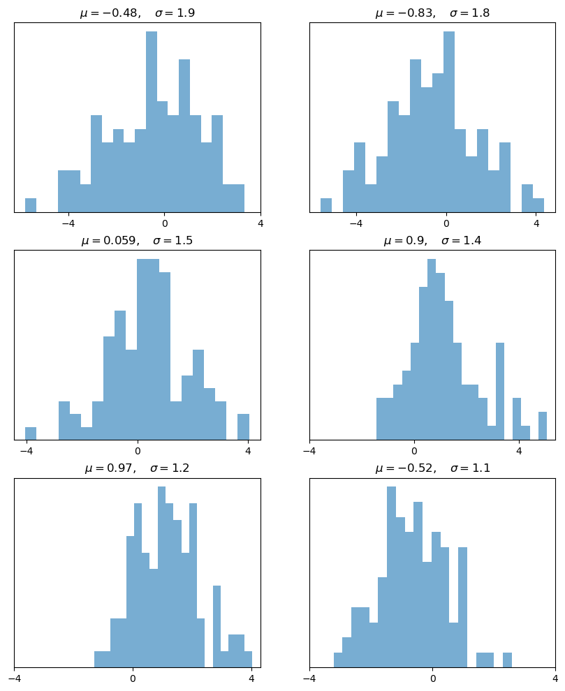
ചിലപ്പോൾ ഒരു figure-ൽ ഒന്നിലധികം subplots ആവശ്യമായി വരും.
6 histograms generate ചെയ്യുന്ന ഒരു example താഴെ കാണാം:
num_rows, num_cols = 3, 2
fig, axes = plt.subplots(num_rows, num_cols, figsize=(10, 12))
for i in range(num_rows):
    for j in range(num_cols):
        m, s = uniform(-1, 1), uniform(1, 2)
        x = norm.rvs(loc=m, scale=s, size=100)
        axes[i, j].hist(x, alpha=0.6, bins=20)
        t = rf'$\mu = {m:.2}, \quad \sigma = {s:.2}$'
        axes[i, j].set(title=t, xticks=[-4, 0, 4], yticks=[])
plt.show()
4.3.3. 3D Plots#
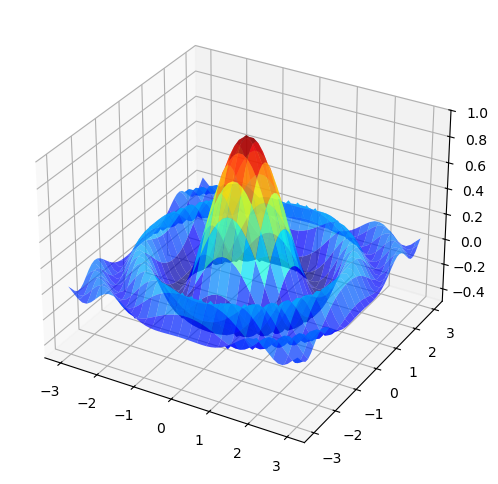
Matplotlib 3D plots വളരെ നന്നായി ചെയ്യുന്നു --- ഒരു example താഴെ കാണാം:
from mpl_toolkits.mplot3d.axes3d import Axes3D
from matplotlib import cm


def f(x, y):
    return np.cos(x**2 + y**2) / (1 + x**2 + y**2)

xgrid = np.linspace(-3, 3, 50)
ygrid = xgrid
x, y = np.meshgrid(xgrid, ygrid)

fig = plt.figure(figsize=(10, 6))
ax = fig.add_subplot(111, projection='3d')
ax.plot_surface(x,
                y,
                f(x, y),
                rstride=2, cstride=2,
                cmap=cm.jet,
                alpha=0.7,
                linewidth=0.25)
ax.set_zlim(-0.5, 1.0)
plt.show()
4.3.4. A Customizing Function#
ഒരുപക്ഷേ നിങ്ങൾ പതിവായി ഉപയോഗിക്കുന്ന ഒരു set of customizations ഉണ്ടായേക്കാം.
For example, നമ്മുടെ axes, origin-ലൂടെ പോകണമെന്നും, അവയിൽ grid ഉണ്ടായിരിക്കണമെന്നും നമുക്ക് ഇഷ്ടമാണെന്ന് കരുതുക.
ഈ മാറ്റങ്ങൾ implement ചെയ്യുന്ന ഒരു custom subplots function, object-oriented API ഉപയോഗിച്ച് എങ്ങനെ build ചെയ്യാം എന്നതിന് Matthew Doty-യുടെ ഒരു നല്ല example താഴെ കാണാം.
Code ശ്രദ്ധയോടെ വായിച്ച്, എന്താണ് നടക്കുന്നതെന്ന് നിങ്ങൾക്ക് മനസ്സിലാക്കാൻ സാധിക്കുന്നുണ്ടോ എന്ന് നോക്കുക:
def subplots():
    "Custom subplots with axes through the origin"
    fig, ax = plt.subplots()

    # Set the axes through the origin
    for spine in ['left', 'bottom']:
        ax.spines[spine].set_position('zero')
    for spine in ['right', 'top']:
        ax.spines[spine].set_color('none')

    ax.grid()
    return fig, ax


fig, ax = subplots()  # Call the local version, not plt.subplots()
x = np.linspace(-2, 10, 200)
y = np.sin(x)
ax.plot(x, y, 'r-', linewidth=2, label='sine function', alpha=0.6)
ax.legend(loc='lower right')
plt.show()
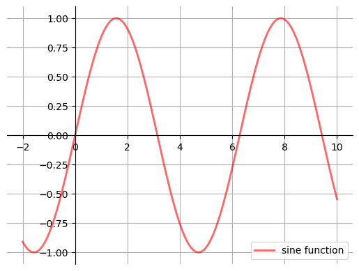
ഈ custom subplots function:
fig, axpair generate ചെയ്യാൻ, internal ആയി, standardplt.subplotsfunction-നെ call ചെയ്യുന്നു,ax-ന് വേണ്ട customizations വരുത്തുന്നു, കൂടാതെfig, axpair-നെ calling code-ലേക്ക് തിരികെ pass ചെയ്യുന്നു.
4.3.5. Style Sheets#
Matplotlib-ലെ വളരെ useful ആയ മറ്റൊരു feature ആണ് style sheets.
Uniform styles ഉള്ള plots create ചെയ്യാൻ നമുക്ക് style sheets ഉപയോഗിക്കാം.
plt.style.available എന്ന attribute print ചെയ്താൽ, available ആയിട്ടുള്ള styles-ന്റെ ഒരു list നമുക്ക് കാണാം:
print(plt.style.available)
['Solarize_Light2', '_classic_test_patch', '_mpl-gallery', '_mpl-gallery-nogrid', 'bmh', 'classic', 'dark_background', 'fast', 'fivethirtyeight', 'ggplot', 'grayscale', 'petroff10', 'seaborn-v0_8', 'seaborn-v0_8-bright', 'seaborn-v0_8-colorblind', 'seaborn-v0_8-dark', 'seaborn-v0_8-dark-palette', 'seaborn-v0_8-darkgrid', 'seaborn-v0_8-deep', 'seaborn-v0_8-muted', 'seaborn-v0_8-notebook', 'seaborn-v0_8-paper', 'seaborn-v0_8-pastel', 'seaborn-v0_8-poster', 'seaborn-v0_8-talk', 'seaborn-v0_8-ticks', 'seaborn-v0_8-white', 'seaborn-v0_8-whitegrid', 'tableau-colorblind10']
ഇനി, plt.style.use() method ഉപയോഗിച്ച് നമുക്ക് style sheet set ചെയ്യാം.
ഒരു style sheet-ന്റെ name input ആയി എടുത്ത്, അതേ style ഉപയോഗിച്ച് വ്യത്യസ്ത plots draw ചെയ്യുകയും ചെയ്യുന്ന ഒരു function നമുക്ക് എഴുതാം:
def draw_graphs(style='default'):

    # Setting a style sheet
    plt.style.use(style)

    fig, axes = plt.subplots(nrows=1, ncols=4, figsize=(10, 3))
    x = np.linspace(-13, 13, 150)

    # Set seed values to replicate results of random draws
    np.random.seed(9)

    for i in range(3):

        # Draw mean and standard deviation from uniform distributions
        m, s = np.random.uniform(-8, 8), np.random.uniform(2, 2.5)

        # Generate a normal density plot
        y = norm.pdf(x, loc=m, scale=s)
        axes[0].plot(x, y, linewidth=3, alpha=0.7)

        # Create a scatter plot with random X and Y values
        # from normal distributions
        rnormX = norm.rvs(loc=m, scale=s, size=150)
        rnormY = norm.rvs(loc=m, scale=s, size=150)
        axes[1].plot(rnormX, rnormY, ls='none', marker='o', alpha=0.7)

        # Create a histogram with random X values
        axes[2].hist(rnormX, alpha=0.7)

        # and a line graph with random Y values
        axes[3].plot(x, rnormY, linewidth=2, alpha=0.7)

    style_name = style.split('-')[0]
    plt.suptitle(f'Style: {style_name}', fontsize=13)
    plt.show()
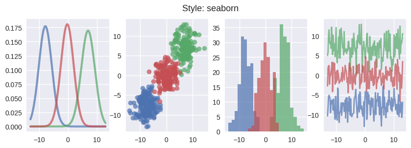
ചില styles എങ്ങനെയിരിക്കുമെന്ന് നമുക്ക് നോക്കാം.
ആദ്യം, seaborn എന്ന style sheet ഉപയോഗിച്ച് graphs വരയ്ക്കാം:
draw_graphs(style='seaborn-v0_8')
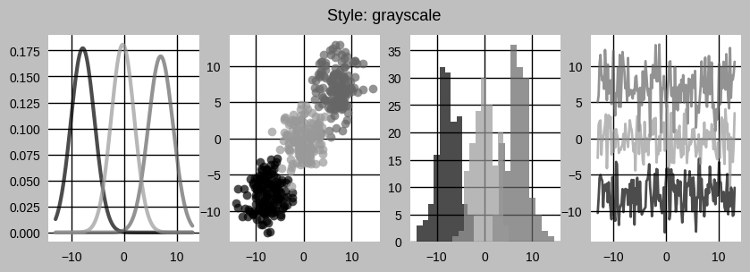
Plots-ലെ colors remove ചെയ്യാൻ നമുക്ക് grayscale ഉപയോഗിക്കാം:
draw_graphs(style='grayscale')
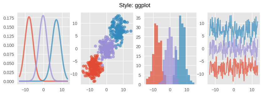
ggplot എങ്ങനെയിരിക്കുമെന്ന് താഴെ കാണാം:
draw_graphs(style='ggplot')
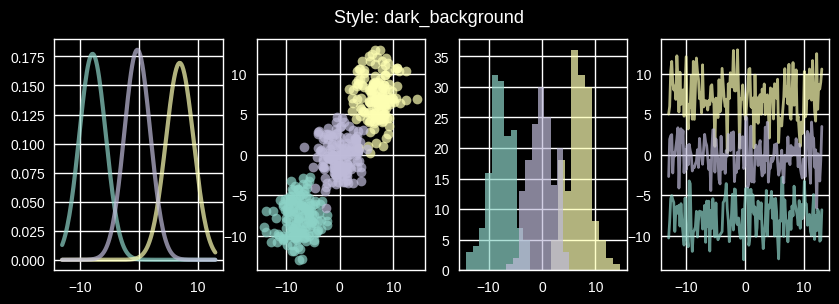
dark_background എന്ന style-ഉം നമുക്ക് ഉപയോഗിക്കാം:
draw_graphs(style='dark_background')
List-ലുള്ള മറ്റ് styles പരീക്ഷിക്കാൻ ഈ function നിങ്ങൾക്ക് ഉപയോഗിക്കാം.
താൽപ്പര്യമുണ്ടെങ്കിൽ, നിങ്ങളുടേതായ style sheets create ചെയ്യാനും കഴിയും.
നിങ്ങളുടെ style sheets-നുള്ള parameters, dictionary പോലെയുള്ള plt.rcParams എന്ന variable-ൽ സൂക്ഷിച്ചിരിക്കുന്നു:
print(plt.rcParams.keys())
Style sheets-ൽ നിങ്ങൾക്ക് set ചെയ്യാൻ കഴിയുന്ന ഒരുപാട് parameters ഉണ്ട്.
നിങ്ങളുടെ style sheet-ന്റെ parameters ഇങ്ങനെ set ചെയ്യാം:
നിങ്ങളുടെ സ്വന്തം
matplotlibrcfile create ചെയ്ത്, അല്ലെങ്കിൽDictionary പോലെയുള്ള
plt.rcParamsഎന്ന variable-ൽ ഉള്ള values update ചെയ്ത്.
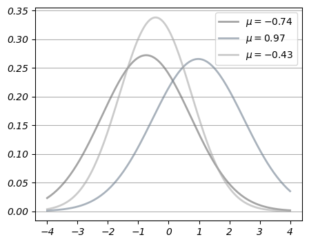
രണ്ടാമത്തെ method ഉപയോഗിച്ച്, overlay ചെയ്തിരിക്കുന്ന density lines-ന്റെ style നമുക്ക് മാറ്റാം:
from cycler import cycler

# set to the default style sheet
plt.style.use('default')

# You can update single values using keys:

# Set the font style to italic
plt.rcParams['font.style'] = 'italic'

# Update linewidth
plt.rcParams['lines.linewidth'] = 2


# You can also update many values at once using the update() method:

parameters = {

    # Change default figure size
    'figure.figsize': (5, 4),

    # Add horizontal grid lines
    'axes.grid': True,
    'axes.grid.axis': 'y',

    # Update colors for density lines
    'axes.prop_cycle': cycler('color',
                            ['dimgray', 'slategrey', 'darkgray'])
}

plt.rcParams.update(parameters)
Note
ഈ settings global ആണ്.
.rcParams-ലെ parameters മാറ്റിയതിനുശേഷം generate ചെയ്യുന്ന എല്ലാ plots-നെയും ഈ setting affect ചെയ്യും.
fig, ax = plt.subplots()
x = np.linspace(-4, 4, 150)
for i in range(3):
    m, s = uniform(-1, 1), uniform(1, 2)
    y = norm.pdf(x, loc=m, scale=s)
    current_label = rf'$\mu = {m:.2}$'
    ax.plot(x, y, linewidth=2, alpha=0.6, label=current_label)
ax.legend()
plt.show()
നിങ്ങളുടെ style-നെ വീണ്ടും default ആക്കി മാറ്റാൻ, default style sheet ഒരിക്കൽ കൂടി apply ചെയ്യുക:
plt.style.use('default')

# Reset default figure size
plt.rcParams['figure.figsize'] = (10, 6)
4.4. Further Reading#
The Matplotlib gallery provides many examples.
A nice Matplotlib tutorial by Nicolas Rougier, Mike Muller and Gael Varoquaux.
mpltools allows easy switching between plot styles.
Seaborn facilitates common statistics plots in Matplotlib.
4.5. Exercises#
Exercise 4.1
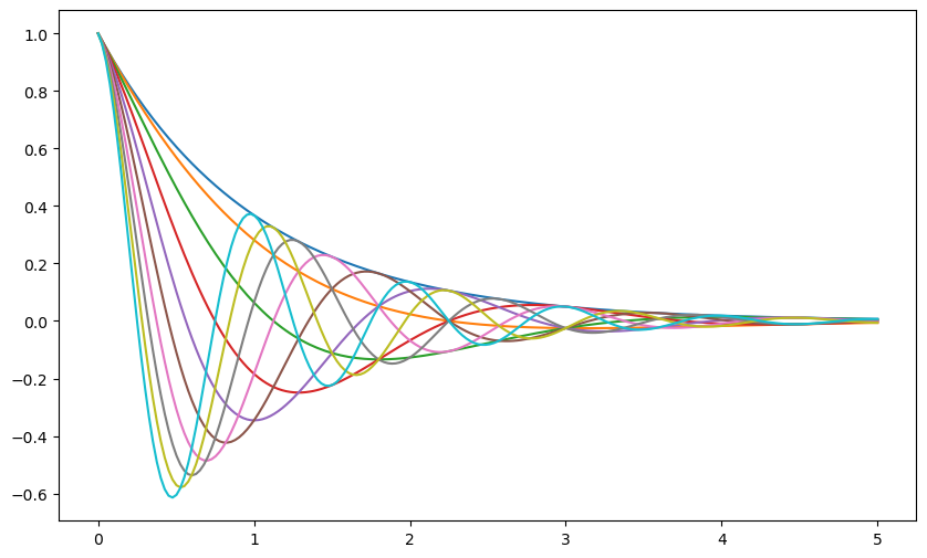
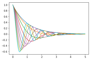
Plot the function
over the interval \([0, 5]\) for each \(\theta\) in np.linspace(0, 2, 10).
Place all the curves in the same figure.
The output should look like this
Solution
Here's one solution
def f(x, θ):
    return np.cos(np.pi * θ * x ) * np.exp(- x)

θ_vals = np.linspace(0, 2, 10)
x = np.linspace(0, 5, 200)
fig, ax = plt.subplots()

for θ in θ_vals:
    ax.plot(x, f(x, θ))

plt.show()